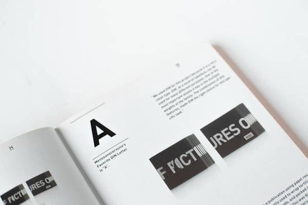
2:3

1:1

16:9

| Accent | Gray | |||||||||
|---|---|---|---|---|---|---|---|---|---|---|
| Solid | ||||||||||
| Soft | ||||||||||
| Accent | Gray | |
|---|---|---|
| Solid | NewNew | NewNew |
| Soft | NewNew | NewNew |
| Surface | NewNew | NewNew |
| Outline | NewNew | NewNew |
Perfect typography is certainly the most elusive of all arts.
Sculpture in stone alone comes near it in obstinacy.
Perfect typography is certainly the most elusive of all arts.
Sculpture in stone alone comes near it in obstinacy.
Perfect typography is certainly the most elusive of all arts.
Sculpture in stone alone comes near it in obstinacy.
Perfect typography is certainly the most elusive of all arts.
Sculpture in stone alone comes near it in obstinacy.
Perfect typography is certainly the most elusive of all arts.
Sculpture in stone alone comes near it in obstinacy.
Perfect typography is certainly the most elusive of all arts.
Sculpture in stone alone comes near it in obstinacy.
| Accent | Gray | Disabled | |||
|---|---|---|---|---|---|
| Classic | |||||
| Solid | |||||
| Soft | |||||
| Surface | |||||
| Outline | |||||
| Ghost | |||||
| Accent | Gray | |
|---|---|---|
| Soft | Please upgrade to the new version. Please upgrade to the new version. | Please upgrade to the new version. Please upgrade to the new version. |
| Surface | Please upgrade to the new version. Please upgrade to the new version. | Please upgrade to the new version. Please upgrade to the new version. |
| Outline | Please upgrade to the new version. Please upgrade to the new version. | Please upgrade to the new version. Please upgrade to the new version. |
Sign up
| Surface | Classic | Ghost | |
|---|---|---|---|
| Size 1 | |||
| Size 2 | |||
| Size 3 |
| Accent | Gray | Disabled | |||
|---|---|---|---|---|---|
| Classic | |||||
| Surface | |||||
| Soft | |||||
| Accent | Gray | |||
|---|---|---|---|---|
| Solid | console.log() | console.log() | console.log() | console.log() |
| Soft | console.log() | console.log() | console.log() | console.log() |
| Outline | console.log() | console.log() | console.log() | console.log() |
| Ghost | console.log() | console.log() | console.log() | console.log() |
| Accent | Gray | |||
|---|---|---|---|---|
| Solid | Right-click here | Right-click here | Right-click here | Right-click here |
| Soft | Right-click here | Right-click here | Right-click here | Right-click here |
| Accent | Gray | |||
|---|---|---|---|---|
| Solid | ||||
| Soft | ||||
The principles of the typographic craft are difficult to master
The principles of the typographic craft are difficult to master
The goal of typography is to relate font size, line height, and line width in a proportional way that maximizes beauty and makes reading easier and more pleasant.
The principles of the typographic craft are difficult to master
The goal of typography is to relate font size, line height, and line width in a proportional way that maximizes beauty and makes reading easier and more pleasant.
The principles of the typographic craft are difficult to master
The goal of typography is to relate font size, line height, and line width in a proportional way that maximizes beauty and makes reading easier and more pleasant.
The principles of the typographic craft are difficult to master
The goal of typography is to relate font size, line height, and line width in a proportional way that maximizes beauty and makes reading easier and more pleasant.
| Accent | Gray | Disabled | |||
|---|---|---|---|---|---|
| Classic | |||||
| Solid | |||||
| Soft | |||||
| Surface | |||||
| Outline | |||||
| Ghost | |||||

Typography is the art and technique of arranging type to make written language legible, readable and appealing when displayed.
Typography is the art and technique of arranging type to make written language legible, readable and appealing when displayed.


Typography is the art and technique of arranging type to make written language legible, readable and appealing when displayed.
Typography is the art and technique of arranging type to make written language legible, readable and appealing when displayed.

Press ⌘ C to show/hide the Theme Panel, or press ⌘ D to toggle dark mode.
Press ⌘ C to show/hide the Theme Panel, or press ⌘ D to toggle dark mode.
Press ⌘ C to show/hide the Theme Panel, or press ⌘ D to toggle dark mode.
Press ⌘ C to show/hide the Theme Panel, or press ⌘ D to toggle dark mode.
Susan Kare is an American artist and graphic designer, who contributed interface elements and typefaces for the first Apple Macintosh personal computer from 1983 to 1986.
Susan Kare is an American artist and graphic designer, who contributed interface elements and typefaces for the first Apple Macintosh personal computer from 1983 to 1986.
Susan Kare is an American artist and graphic designer, who contributed interface elements and typefaces for the first Apple Macintosh personal computer from 1983 to 1986.
Susan Kare is an American artist and graphic designer, who contributed interface elements and typefaces for the first Apple Macintosh personal computer from 1983 to 1986.
Susan Kare is an American artist and graphic designer, who contributed interface elements and typefaces for the first Apple Macintosh personal computer from 1983 to 1986.
Susan Kare is an American artist and graphic designer, who contributed interface elements and typefaces for the first Apple Macintosh personal computer from 1983 to 1986.
A man who would letterspace lower case would steal sheep,Frederic Goudy liked to say. The reason for not letterspacing lower case is that it hampers legibility. But there are some lowercase alphabets to which this principle doesn’t apply. Moderate letterspacing can make a face such as lowercase Univers bold condensed more legible rather than less
| Accent | Gray | Disabled | |||
|---|---|---|---|---|---|
| Classic | |||||
| Surface | |||||
| Soft | |||||
| Accent | Gray | Placeholder | Disabled | |
|---|---|---|---|---|
| Classic | ||||
| Surface | ||||
| Soft | ||||
| Ghost |
| Accent | Gray | Disabled | |||
|---|---|---|---|---|---|
| Classic | |||||
| Surface | |||||
| Soft | |||||
| Accent | Gray | Disabled | |||
|---|---|---|---|---|---|
| Classic | |||||
| Surface | |||||
| Soft | |||||
| Surface | Ghost | |
|---|---|---|
| Size 1 | ||
| Size 2 | ||
| Size 3 |
The goal of typography is to relate font size, line height, and line width in a proportional way that maximizes beauty and makes reading easier and more pleasant. The question is: What proportion(s) will give us the best results? The golden ratio is often observed in nature where beauty and utility intersect; perhaps we can use this “divine” proportion to enhance these attributes in our typography.
The goal of typography is to relate font size, line height, and line width in a proportional way that maximizes beauty and makes reading easier and more pleasant. The question is: What proportion(s) will give us the best results? The golden ratio is often observed in nature where beauty and utility intersect; perhaps we can use this “divine” proportion to enhance these attributes in our typography.
The goal of typography is to relate font size, line height, and line width in a proportional way that maximizes beauty and makes reading easier and more pleasant. The question is: What proportion(s) will give us the best results? The golden ratio is often observed in nature where beauty and utility intersect; perhaps we can use this “divine” proportion to enhance these attributes in our typography.
The goal of typography is to relate font size, line height, and line width in a proportional way that maximizes beauty and makes reading easier and more pleasant. The question is: What proportion(s) will give us the best results? The golden ratio is often observed in nature where beauty and utility intersect; perhaps we can use this “divine” proportion to enhance these attributes in our typography.
| Accent | Gray | Disabled | Read-only | |
|---|---|---|---|---|
| Classic | ||||
| Surface | ||||
| Soft |
| Accent | Gray | Disabled | Read-only | |
|---|---|---|---|---|
| Classic | ||||
| Surface | ||||
| Soft |